A factory has 10,000 sensors.
Engineers had no way to explore them
without writing code.
Every machine on that floor broadcasts constantly, vibration, pressure, heat, fault codes, through a single protocol the industrial world agreed on years ago. But reading one sensor meant opening a code editor and writing 50 lines of connection logic from memory. Every single time.
We built the tool that let them just look.
OPC UA is that protocol. My job was to work out whether we should build the tool at all, and if so, what it should do.
Five tools became one.
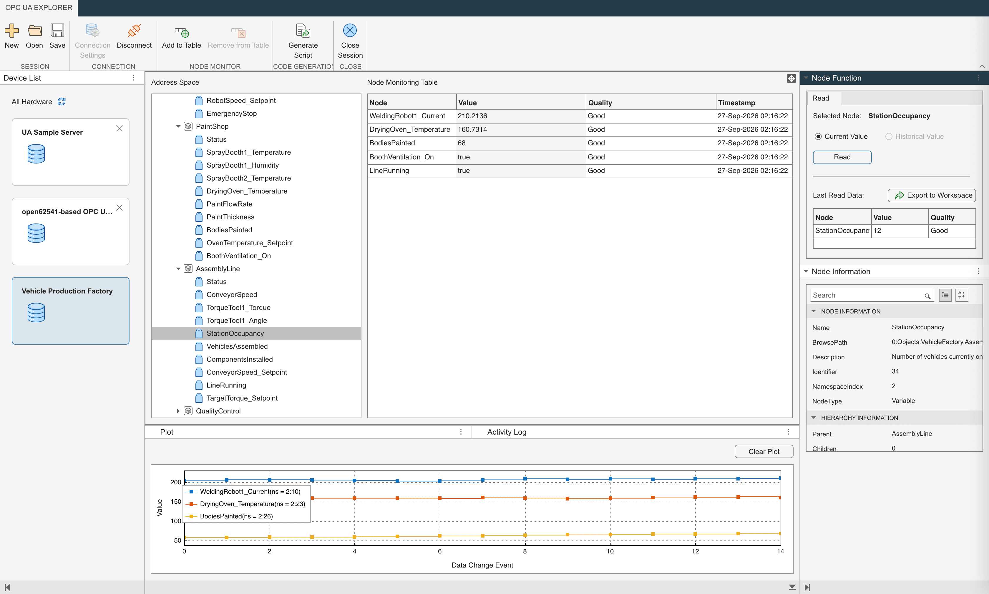
Connect to a factory, browse what is in it, watch values update, then press one button and leave with the whole session as runnable MATLAB. That work used to be spread across five separate tools, and whatever you worked out by clicking had to be rebuilt as code before it was worth anything to your team.
What is different now
Two things changed as a result: one for the engineer using it, one for us.
For the engineer
- Fewer touchpoints to get from “I need this sensor” to having the data.
- A steep OPC UA learning curve flattened. You no longer have to be an expert to start.
- No more waiting on the one person on the team who knows the protocol.
- Attention back on the actual job, the business logic, instead of on OPC UA itself.
For MathWorks
- Customers enter the MathWorks ecosystem early, instead of starting in a third-party client and moving on to vendor-specific platforms or open-source alternatives.
- The team stopped building the wrong thing. Every “what do we skip” conversation happened before the code got written, so we avoided a round of rework we would otherwise have paid for. Harder to put a number on, and the part I would argue mattered most.
How we know it is working
We track the customer escalations that come in asking what code to write to connect to their hardware. Since the app shipped, that number has come down.
Tracked from R2026a onward. Happy to talk through the actual numbers.
My Role
Lead UX researcher, and a strategic partner in deciding what we built.
The Question
Is it worth building our own GUI app, when third-party OPC UA clients already exist?
What Shipped
OPC UA Explorer, in MATLAB R2026a. Explore the factory in the app, then export the session as MATLAB code.
Was it worth building our own app at all?
That was the research goal, and it was a real question, not a formality on the way to a yes. There was already a market full of third-party OPC UA clients, some paid, some open source, all of them able to read from and write to a server. We also already shipped an API: a MATLAB user could write the code today and get the same result.
So the honest version of the question was narrower. What would our app do that those two things don’t? If the answer was “nothing much,” the right recommendation was to not build it.
Yes, build it. Nobody can do this work in one place, and everything you learn by clicking has to be rebuilt as code afterwards.
Three things came out of discovery and pointed the same way. The workflow was spread across several different tools. If you were not an OPC UA expert, you depended on someone who was, and waited for them. And whatever you worked out by clicking around, you then had to reproduce in code before it was worth anything to the rest of your team.
So the app has a specific shape. Explore the factory in the app, then export the session as MATLAB code. You do the fiddly interactive part where interaction is cheap: connecting, browsing, subscribing, checking a value is what you think it is. Then you take the result out as a script you can scale, schedule, or hand to whoever comes next.
Six kinds of engineer, one first step
MathWorks sells the nuts and bolts. Engineers use our toolboxes to talk to hardware, get data out of it, and build something with it. The people who end up in the Industrial Communication Toolbox are doing six fairly different jobs, and what they share is the first step: get the data out of the factory.
Predictive maintenance
Builds tools that let other engineers watch the health of factory equipment before it fails.
Machine learning
Trains algorithms that predict factory output so an operator can plan against it.
Factory automation
Automates the steps on the floor that people are still doing by hand.
Digital twins
Simulates the factory to test which components to buy and how they behave together, without risking the real hardware. Virtual commissioning.
HMI / SCADA
Builds the panels a factory operator uses to control one specific part of the plant.
Straight exploration
Just needs to talk to the factory and see what is in it, without writing code to get there.
All six of them were also on a clock none of us set. The protocol they had relied on for two decades was being switched off under them, and most of them could not write the code to move to its replacement.
Five minutes on OPC UA, if you need them
Five minutes on OPC UA, if you need them
OPC UA is the language industrial machines use to talk to each other. The hardware companies settled on it as a common standard so that anyone could communicate with their machines without building a custom integration for every vendor. The Industrial Communication Toolbox is the part of MATLAB that does that talking, over OPC UA and the other protocols a factory might speak.
When our software connects to a factory’s OPC UA server, what it sees is an address space, the table of contents of everything that factory is broadcasting. Each entry is a node: one temperature reading, one valve position. To watch a node change over time, you create a subscription.
Vocab · 1
Address space
Table of contents of a factory’s data, in chapters and sub‑chapters.
Vocab · 2
Node
One entry: a single sensor value or valve position.
Vocab · 3
Subscription
Ask once; updates arrive whenever the value changes.
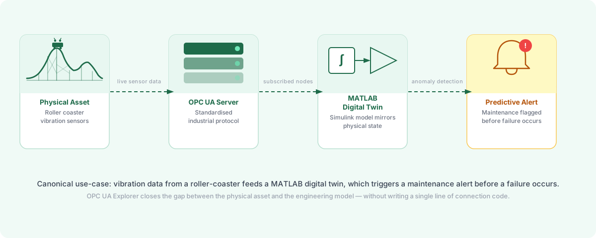
The deadline came from OPC DA, the protocol our customers had relied on for two decades. It was being deprecated industry-wide. Sensor manufacturers were dropping support and our own product was scheduled to drop it too. Engineers everywhere from amusement-park ride safety to ship-building to energy-grid monitoring had to move across to OPC UA, and most of them did not have the programming background to write OPC UA scripts from scratch.
Four stages, fifteen months
I led the research and acted as a strategic partner in planning, not just running studies but shaping which problems were worth solving and which weren’t. I scoped discovery, ran the contextual interviews, facilitated the design workshop, designed and ran the usability study, and presented to both design review forums. When the team had to choose between competing feature requests, I was the one tying every recommendation back to evidence.
A discovery sprint with engineers across four industries (automotive controls, amusement-park digital twins, PLC virtual commissioning, ship-building), plus contextual inquiry with our own Advanced Support Group, who field these problems from customers every day. I built the screener, the interview guide and the requirements document, and led synthesis with the developer and design lead.
I ran a cross-functional sketching workshop off the back of the requirements, compiled the results into a preferred and an alternate design, and took both to two senior review forums. The forums did not agree with each other, which is what set up the study that followed.
A task-based study with 5 external participants from four industries. The scenario: help a systems engineer at an amusement-park operator read ride vibration sensors and inspect their values. Each session was a contextual inquiry. Twenty-seven findings came out, distilled into five high-priority themes, and an answer to the disagreement from Stage 2.
I presented the prototype and findings to the internal design review, tracked feedback across 13 interface areas, and worked with the developer on an honest response to each: what we agreed with and would change, what we disagreed with and why. Then handover to development, a readout of what changed and why, and a final review run as a usability session to get the go-ahead to ship.
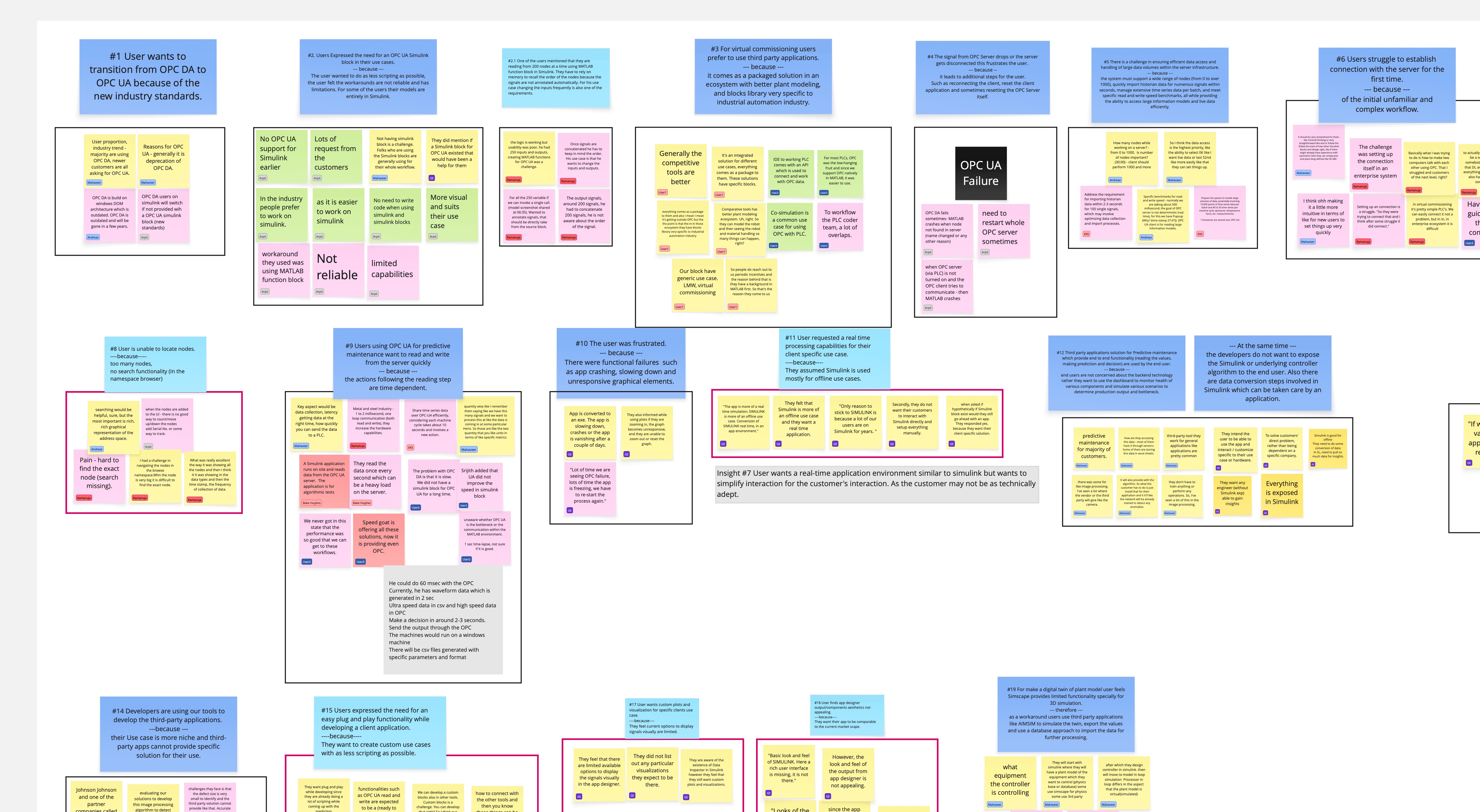
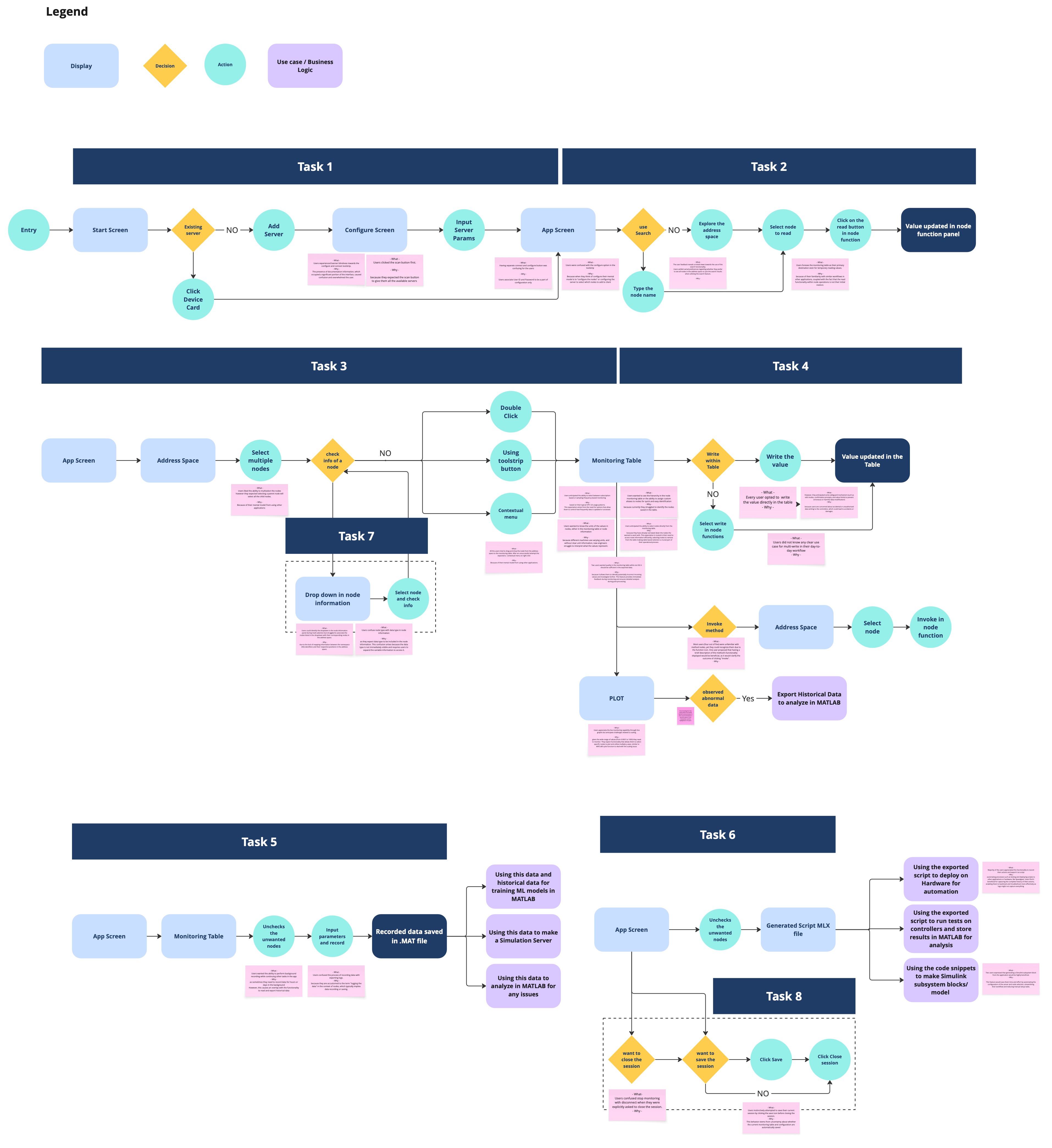
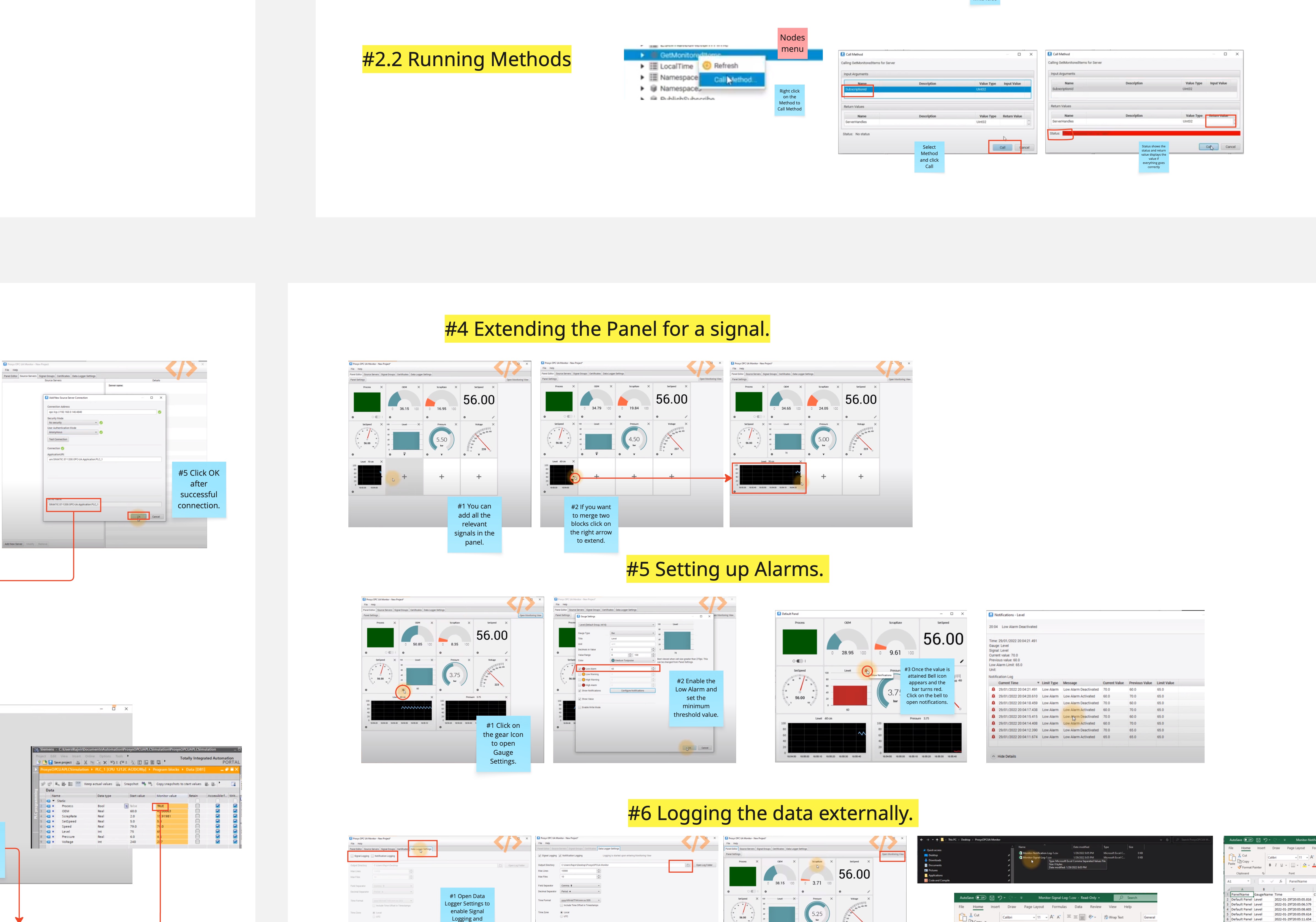
Synthesis artifacts: affinity mapping, task flows, and competitor benchmarking across the 15-month process
What discovery told us
Before we tested anything, four external contextual interviews, plus time with our own Advanced Support Group, the engineers who field these problems from customers, told us why the existing workflow was failing, and which engineer to design for first. We benchmarked the third-party clients alongside it, so we knew what we would be judged against.
The hard part
Earning the right to ask the next question
I was onboarding into this domain at the same time as I was researching it, and the people I was interviewing had been in it for twenty-five years. Some worked in defence and could share almost nothing. No context, no screenshots, no names, because their rules said so. Others were startup founders working with mid-scale factories, or ran multiple PSU plants, or built commercial mobile manufacturing lines, adventure-park rides, submarines.
Every one of them had a different problem on the surface. My job was to find the part underneath that was the same, stay honest about where my toolbox’s responsibility ended, and sound competent enough in the room that an engineer of twenty-five years would keep talking to me. That last part was most of the work in the first few weeks.
Discovery 01
The barrier isn’t motivation, it’s programming background
What they actually want
Impact →
Locked the primary persona; established a hard design-review rule: every interaction discoverable without reading docs.
Discovery 02
The strongest pull came from the digital-twin engineer, not the bench technician
The anchor isn’t the loudest. It’s the one with the worst alternative.
Impact →
Amusement-park digital-twin scenario became the canonical demo flow: the connect → browse → subscribe → see-it-update path users meet first.
Stage 1 ended with functional and non-functional requirements, and a readout where we prioritised them together as a team: what ships in v1, what parks for v2, and what sits outside what we should be doing at all. That was the point we committed to building it.
Getting the best design out of nine people
With requirements agreed, the question changed from should we build this to what should it look like. I ran a Crazy 8’s workshop rather than designing it myself. The domain knowledge in that room was spread across nine people and none of them was me.
In the room
Nine people. The designers and about half the developers had never worked in this domain.
- 1
I put the workflow up
One consolidated user workflow, built from the requirements, so everyone sketched against the same steps.
- 2
Everyone sketched
For each step of that workflow, every person in the room drew their own version. Nine people, no hierarchy on the page.
- 3
Dot voting
We voted on the sketches, then I compiled the winners into a preferred design and an alternate to take to review.
The thing I had to manage was who dominated. The developers who knew OPC UA deeply could have decided every screen by default, and the designers and the developers who didn’t know the domain would have deferred to them, which would have given us a design that was technically correct and unusable by the people we’d just interviewed.
My job is not to make the best design. It is to get the best design out.
We combined the sketches into design cases, a preferred direction and an alternate, and took both to two forums. One was the App Design Review: senior UX VPs and principal designers. The other was the Hardware Design Review: the VP of MATLAB and the customer-facing engineers. Between them, more than eight senior reviewers.
They did not agree with each other.
App Design Review
- Senior UX VPs
- Principal designers
Closest to the platform and its conventions.
Hardware Design Review
- VP of MATLAB
- Customer-facing engineers
Closest to what customers ask for out loud.
The question they split on
Where does an action live?
Eight-plus senior reviewers, two forums, no agreement, and every one of them had a defensible case. This is where Stage 2 ended.
I could have picked a side and defended it. Both sides outranked me, both had a real argument, and whichever one I chose, I would have been choosing on taste. So I did the other thing available to me: I turned the disagreement into something testable.
I made the argument testable
I went back and watched every recording from both forums. Out of that I wrote more than fifty specific research questions, one for each thing a reviewer had actually doubted, including every version of “where should this action live.” Then I condensed them into hypotheses and four high-level research questions, so the study covered the whole disagreement rather than the parts I happened to find interesting.
All the feedback was valid. That was the problem, and the reason this had to be settled with users rather than in a room.
Five participants, four industries, task-based sessions run as contextual inquiries. Twenty-seven findings came out; five themes carried the weight. Each one below follows the same shape: observation, insight, recommendation, what shipped. Open any of them for the detail.
Theme 1Configure didn’t mean configure. Logging didn’t mean logging.
Shipped
Configure didn’t mean configure. Logging didn’t mean logging.
Observation
Five separate findings circled the same problem: labels overloaded or contradicted terms engineers already used. Configure in the toolstrip read as “set up the nodes,” not “configure the connection.” Stop Monitoring read as “disconnect from the server.” Export Log got pulled into the gravitational field of “logging the data,” the engineer’s phrase for recording sensor values, so people clicked it expecting their captured data to come out. And in the right pane, Variable Information (which held the Data Type field engineers cared about most) sat collapsed behind a disclosure that participants didn’t open.
“I am already connected to the server. Configure may have user password, security password. I think configure is more of configuring the user ID, password.”UT4, on the Configure / Connect ambiguity
Insight
Terminology debt compounds silently. Each label was defensible in isolation; together they formed a vocabulary that didn’t survive contact with a working engineer. The worst part of the failure mode: users didn’t say “I’m confused.” They confidently took the wrong action and assumed they’d succeeded.
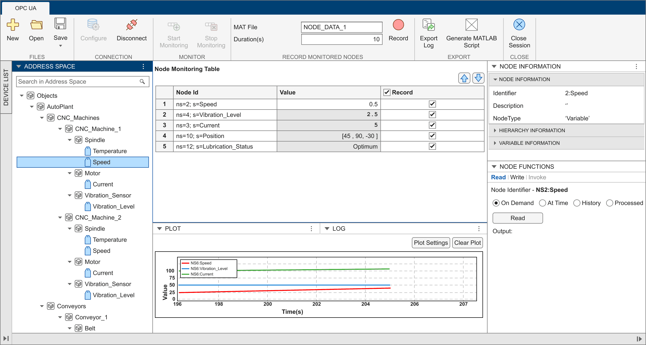
- 1Configure read as “set up the nodes” or “the place for user ID and password.” Nobody read it as connection settings.
- 2Start Monitoring and Stop Monitoring read as connect and disconnect from the session.
- 3Export Log pulled “logging” toward the engineer’s meaning: recording sensor values. People clicked it expecting their captured data.
- 4Variable Information held the Data Type field engineers cared about most, collapsed behind a disclosure nobody opened.

- 1Renamed to Connection Settings. The button now carries the meaning it always implied.
- 2Renamed to Add to Table. The verb describes the effect on the visible UI, not the abstract subscription.
- 3Renamed to Remove from Table, its exact opposite.
- 4Export Log is gone. What people actually wanted from it is Generate Script, in its own Code Generation group.
The four renames, line by line
| Label shown | What users heard | What shipped |
|---|---|---|
| Configure | “Set up which nodes to add” or “the place for user ID and password” | Renamed to Connection Settings. The button now carries the meaning it always implied. |
| Start Monitoring / Stop Monitoring | “Connect” / “Disconnect from the session” | Renamed to Add to Table / Remove from Table. The verb describes the effect on the visible UI, not the abstract subscription. |
| Export Log + Log tab | “Export my recorded data.” “Logging” meant captured sensor values, not events | Export Log removed entirely. The bottom-dock Log tab renamed to Activity Log so its scope is unambiguous. |
| Variable Information (collapsed) | “Where’s the data type?” The field engineers cared about most lived behind a disclosure | Expanded by default. Data Type is now visible at first glance alongside the rest of Node Information. |
Recommendation
Rename to verbs engineers say at the bench. Delete the action whose name is the source of the confusion rather than renaming it. And don’t hide the metadata users came to see.
What shipped
ShippedAll four changes landed in the next build. The most consequential move wasn’t a rename. It was deleting Export Log outright. Its presence was the entire reason “logging” collided with “recording.” A rename would have kept the trap; removing it closed it.
Theme 2Engineers expected the action panel above the metadata, not below it
Shipped
Engineers expected the action panel above the metadata, not below it
Observation
Every participant who tried to read a sensor value scrolled past the “Node Function” panel without seeing it. They were drawn to the larger “Node Information” panel, which only displays metadata, and then asked, “Where do I read the value?”
Insight
We had laid the panels out in the order the data structure suggested (“here’s what this node is, then here’s what you can do with it”) instead of the order the user’s intent demanded.
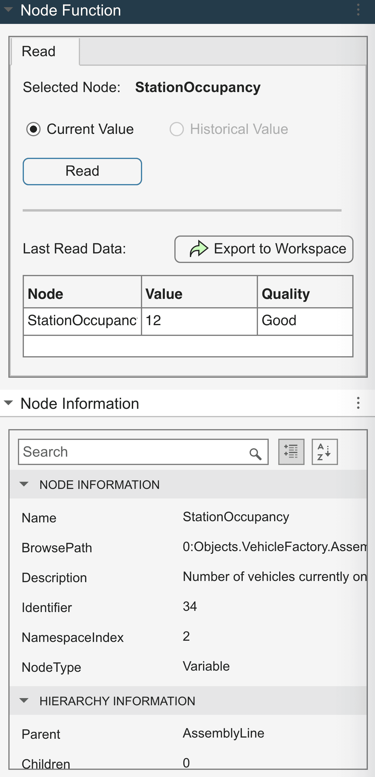
- 1Node Function now sits on top. What can I do here?
- 2Node Information moved below it. What is this?
Recommendation
Swap the two panels. Action above metadata. Don’t try to teach the user a new mental model when their existing one is already correct.
What shipped
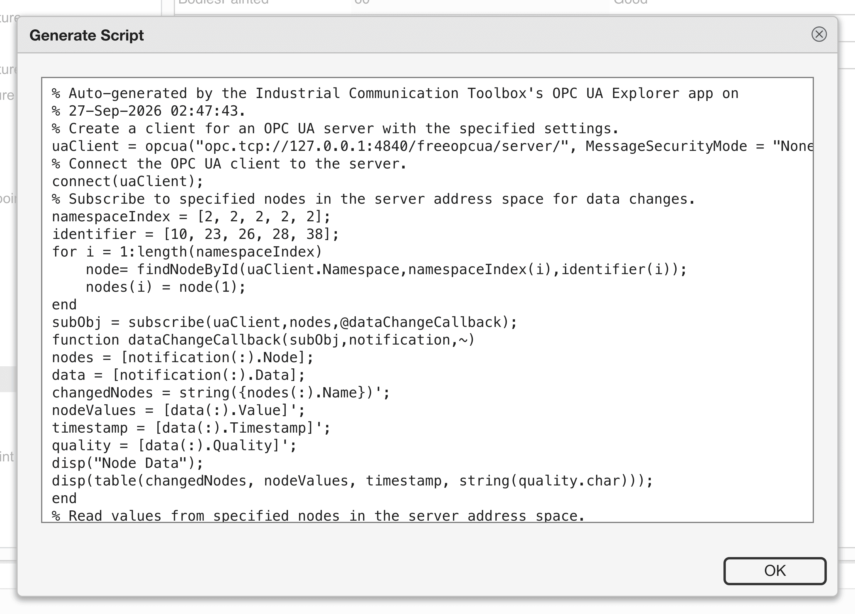
ShippedPanels swapped in the next build. We also added a Generate Script button, validated against the historical-data export pattern that surfaced six times across the study. A click produces a MATLAB Live Script that recreates the session as code.
Theme 3The address space was a tree without a search box, and engineers got lost
~ Partially shipped
The address space was a tree without a search box, and engineers got lost
Observation
Real factory address spaces have thousands of nodes. Participants spent 30–90 seconds per task hunting for nodes by hand-expanding tree branches.
“This is like opening every folder on a corporate file server to find one document.”Participant struggling with the tree-without-search
Insight
An address space without search is a library without a card catalog. The tree was correct; what was missing was a way into the tree. Participants who’d used a competitor product, UA Expert, kept reaching for the search bar that didn’t exist.
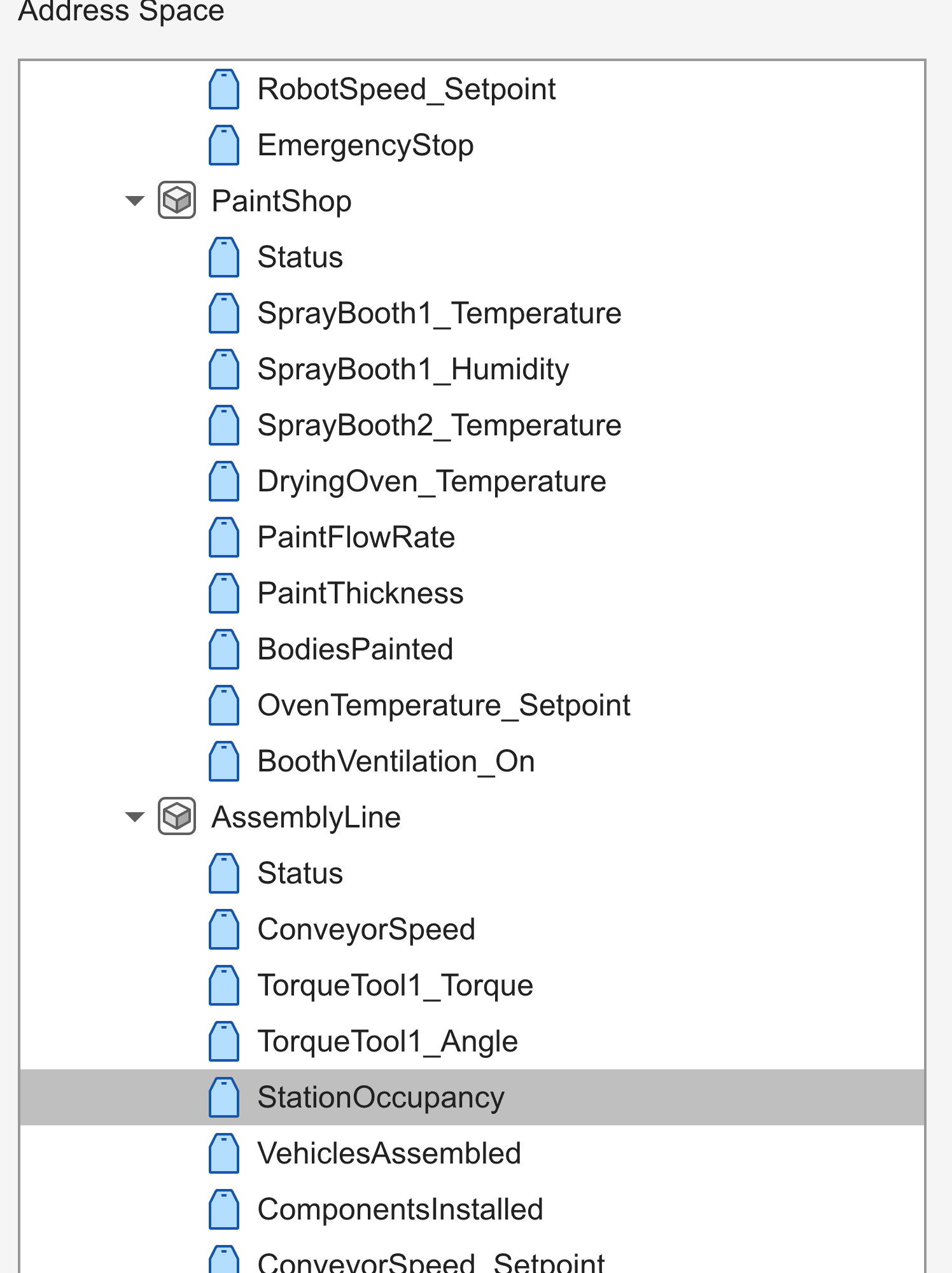
- 1Nothing here. Participants who had used UA Expert kept reaching for a search bar that did not exist.
- 2Finding one node means hand-expanding branches. Real factory address spaces run to thousands.
Recommendation
Add a search bar at the top of the address space. Match nodes by name and by browse path. Ship search on the API side first (where it’s cheap), then bring it into the app.
What shipped
~ Partially shippedAPI-side search shipped in the same release. In-app search was deliberately de-scoped to a follow-up. We needed more data on which search behaviors mattered most (substring vs. fuzzy, recent vs. favorites).
Theme 4Engineers wrote to read-only nodes and got cryptic errors
Shipped
Engineers wrote to read-only nodes and got cryptic errors
Observation
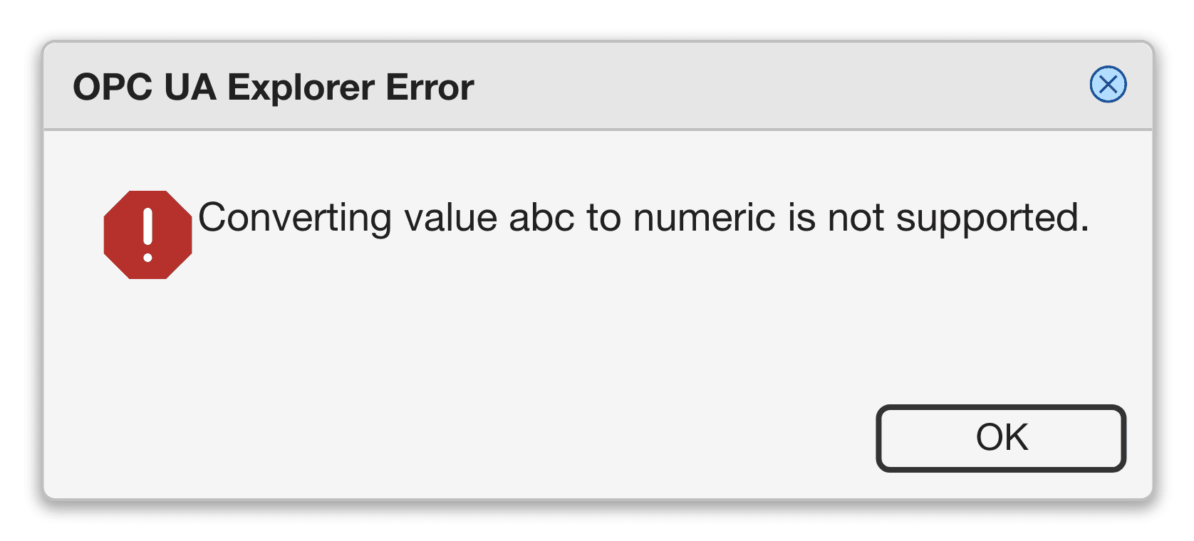
Three of the five participants tried to write a value to a node that was server-side read-only. The app accepted the input, sent the write, and surfaced a vague BadWriteNotSupported error from the server. Two participants assumed they’d typed the value wrong and tried again. One walked away frustrated.
Insight
The mistake wasn’t a typing error. It was a discoverability failure. The app gave no visual signal that a node was read-only before you tried to write to it. Engineers who know read/write permissions exist still don’t carry that knowledge to every node they look at; they expect the interface to surface it.
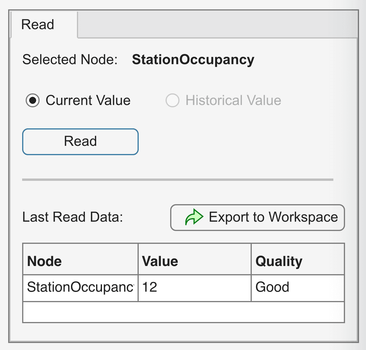
- 1No Write tab here. StationOccupancy is read-only, so the app never offers a write the server is going to reject. On a writable node the tab appears in this space.
Recommendation
Visually grey out cells in the monitoring table for read-only nodes. Don’t change the underlying behavior, just close the loop on the affordance.
What shipped
ShippedThe Node Function panel now exposes a Write tab only when the selected node permits writing. Read-only nodes show only a Read tab, so the user never starts a write the server will reject.
Theme 5Critical metadata was missing where engineers looked for it
Shipped
Critical metadata was missing where engineers looked for it
Observation
When a participant inspected a node, they expected to see four things together: the value, the unit (°C or psi or m/s²), the data quality (is this reading trustworthy right now?), and the sampling frequency (how fresh is this number?). The app showed value and partial metadata; the rest required clicking into a separate panel.
Insight
Engineers don’t read sensor values in the abstract. A temperature reading without a unit and a quality flag is decoration, not data. The app was forcing them to assemble context across multiple panels every time they checked a value.
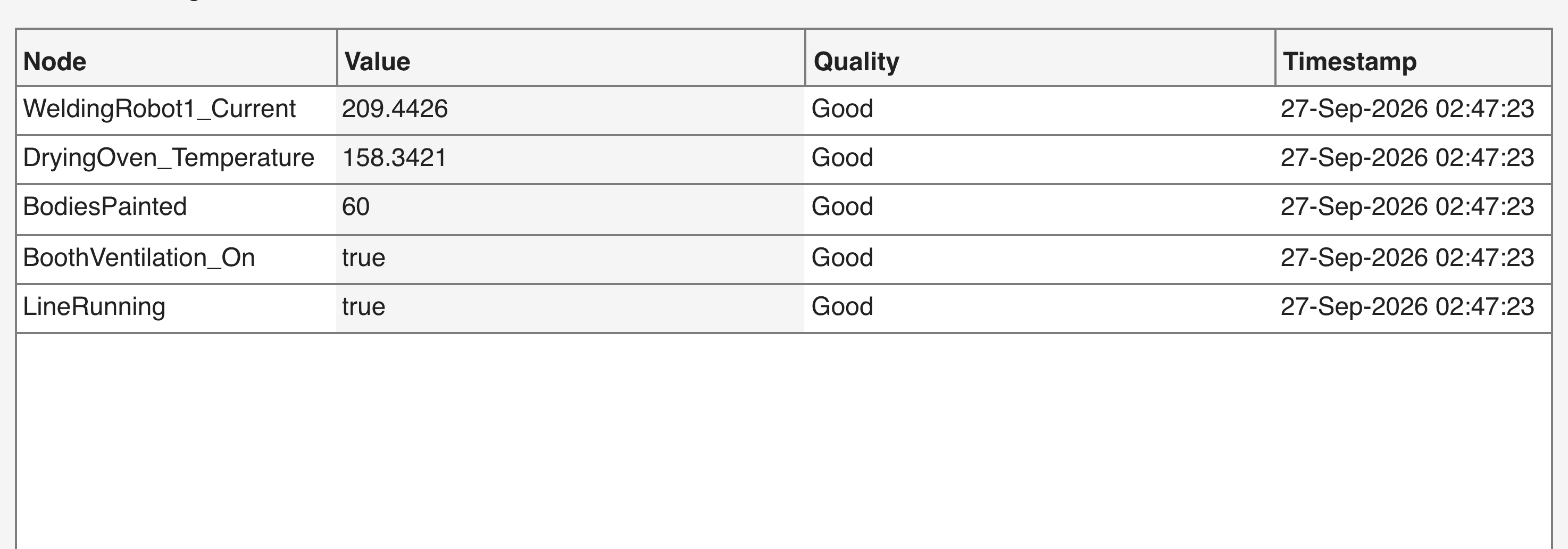
- 1The Value, which was never the problem.
- 2Quality inline. Is this reading trustworthy right now?
- 3Timestamp inline. How fresh is this number?
Recommendation
Surface unit, data quality, and last-update timestamp inline with every value, in the monitoring table. Make the answer to “is this reading trustworthy right now?” a glance, not a workflow.
What shipped
ShippedQuality and timestamp shipped as inline columns. Units were deliberately kept out of the table; they sit in the Node Information panel as secondary data. Mixing unit strings into the table would force every Generate-Script consumer to strip them before computation. The secondary-data placement preserves both context and the numeric pipeline.
Back to the disagreement
The study answered the question the forums couldn’t
Nobody in either forum was wrong about their own reasoning. They were reasoning about different users. The study replaced the argument with evidence. Participants read toolstrip labels as descriptions of what would happen to the thing in front of them, which is why Start Monitoring became Add to Table. They looked for the action beside the node they had selected, not above it, which is why the panels were swapped. And the workflows nobody could place cleanly stayed out of v1 rather than being forced into a pop-up to end the debate.
On the placement question itself, the direction the Hardware Design Review had preferred was the one participants took to. That forum was the VP of MATLAB and the customer-facing engineers, the people who sit closest to customers all day. They turned out to be right about customers. But they were right in a room where they could not prove it, next to a forum of senior UX VPs and principal designers who were arguing just as reasonably from the platform side. Seniority could not separate those two positions. Five participants and a task list could.
That is the part I would defend hardest. The disagreement was real and expensive, and the way out of it was not picking whoever outranked me.
Where I had to take a position
The design review wasn’t a checkpoint. It was the round where I had to decide what to ship now, what to defer and what to push back on, in front of senior reviewers across engineering and design, across thirteen interface areas.
Most of those positions were the study speaking. The renames, the panel swap and the deferral of in-app search are all findings from above, argued back into the room with the evidence attached. One of them was mine before it was anybody’s.
IDR Moment 01
I advocated for a Generate-Script button before anyone asked for it
Observation
The product team’s instinct was to defer export functionality. “They can copy it manually, or use the API for that.” From the usability study, I’d already seen three of five participants reach for some equivalent of “save this to a file” or “get this into a script” within the first five minutes.
My Stance
I argued, with the usability evidence behind it, that export was the moment the app stopped being a viewer and started being a tool. Without it, every digital-twin use case would have the engineer dropping back to the API the moment they had data they wanted to keep. I framed it as a v1 must-have, not a stretch goal.
Outcome
Shipped in R2026a. The Generate-Script button sits in the toolbar under CODE GENERATION; a click produces a MATLAB Live Script with the session reconstructed as code.
What shipped, and what didn’t
The OPC UA Explorer shipped in MATLAB R2026a, about fifteen months after the first contextual interview, and you can read its public documentation at mathworks.com/help/icomm/ug/opcuaexplorer-app.html. The research also generated an 11-item feature-request pipeline that has shaped the next two releases. As a strategic partner in project planning, I helped the team decide what not to ship in v1 just as much as what to ship.
The eleven deferrals, one by one
The eleven deferrals, one by one
| Feature request | Decision | Rationale |
|---|---|---|
| In-app address-space search | Deferred to next release | Search shipped on the API first; in-app search needed more data on which behaviors mattered |
| Right-click contextual menus on monitoring table rows | Deferred, enhancement request to underlying UI table component | Required platform-level change; not blocked on UX |
| Cross-correlation plots between two nodes | Deferred to a later release | Strong signal but small sample of users requesting it |
| Custom alarms on monitoring values | Deferred, covered by Simulink workflow today | Use case existed but had a viable workaround |
| Save/load app session layout | Deferred, enhancement request to platform | Required Hardware Manager–level change |
| Six other smaller asks | Deferred or absorbed into existing features | Mix of low frequency, high cost, or already in the roadmap |
Saying no with reasons is part of the job. Every deferral above traces back to a specific finding from the usability study or design review, not to engineering fatigue.
Then it went to development to be built for real. I presented what had changed since the last time each group had seen it and why, and we ran the final design review as a usability session rather than a slideshow. We put the working product in front of the people signing it off and let them try it. That was the green flag.
The constraints, and the two things I’d change
What we traded away
Four decisions that cost us something
- We dropped workflows at the requirements stage, before anyone had designed them. Cheaper to cut an idea than a screen.
- Configuration, read and write went into v1. Methods waited. That call came from code telemetry alongside the interview data. We could see what people actually reached for in the API, and it matched what they had told us.
- The six-panel layout was fixed. It wasn’t ours to change, so the design had to be good inside it.
- Drag-and-drop and contextual menus weren’t supported by the underlying infrastructure, so we designed around them. That limitation became the contextual menu project, picked up as a company-wide Tier 1 effort by the core MATLAB workflows team, and currently in continuous research and prototyping. A constraint we had to design around on one app turned into a platform problem worth solving for everybody.
What I’d do differently
I’d start the strategic-planning conversation earlier. The research drove the right product, but I waited until I had data to bring strong opinions to the form-factor and scoping discussions. If I’d had this lens from week one, I’d have run a structured form-factor workshop before the usability study, committing the team to “this will be an app, not a Simulink block, because here’s the reasoning” before we sunk months into a particular UI direction. That is exactly what we did on our next product, the OPC UA Server. The discipline came directly from this case.
I’d run a smaller, faster usability round earlier, with 2 or 3 participants, to validate the prototype skeleton before the full 5-participant study. Several of the 27 findings were structural enough that an early micro-study would have caught them at a fraction of the cost. Five-participant studies are the right tool for “is this ready to ship?” They are a heavy hammer for “is this on the right track?”